The colour of prohibition signs is a crucial aspect of visual communication and safety in both public and private spaces. These signs are designed to convey important rules or restrictions at a glance, ensuring that individuals understand what actions are forbidden. The choice of colour in prohibition signs is not arbitrary; it follows internationally recognized standards that maximize visibility, clarity, and comprehension. Understanding the rationale behind the colour, its psychological impact, and the specific contexts in which these signs are used can help businesses, organizations, and individuals comply with safety regulations while effectively communicating rules and restrictions.
Understanding Prohibition Signs
Prohibition signs are a type of safety sign used to indicate actions or behaviours that are not allowed in a specific area. They are commonly found in workplaces, public spaces, industrial environments, and transportation systems. The primary function of these signs is to prevent accidents, ensure compliance with laws, and protect individuals from harm. Because prohibition signs communicate restrictions, their design prioritizes clarity and immediate recognition. Colour, shape, and symbols all work together to convey a clear message without requiring extensive reading or interpretation.
Key Features of Prohibition Signs
The effectiveness of prohibition signs relies on several standard features
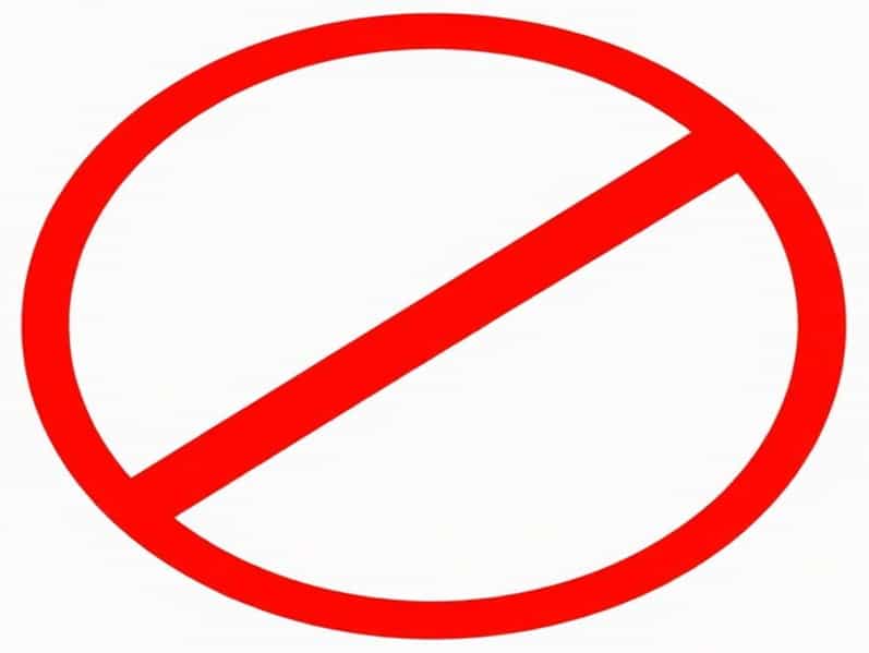
- Red Circle with Diagonal LineMost prohibition signs use a red circular border with a diagonal line running from the top left to the bottom right to indicate no or not allowed.
- White BackgroundThe interior of the circle is typically white to enhance contrast and ensure the symbol or image inside is easily recognizable.
- Black PictogramThe action being prohibited, such as smoking, using a mobile phone, or entering a restricted area, is usually represented in black for maximum visibility against the white background.
- Simple SymbolismThe pictogram is designed to be universally understandable, minimizing language barriers and ensuring immediate comprehension.
The Significance of Colour
Colour plays a fundamental role in prohibition signs because it communicates meaning without the need for words. Red, in particular, is the dominant colour used for prohibition signs worldwide. This choice is based on several factors including visibility, psychological impact, and international standardization. Red is associated with danger, alertness, and the need for immediate attention, making it an ideal choice for signs that require compliance to prevent harm or legal violations.
Psychological Impact of Red
The colour red has strong psychological associations that enhance the effectiveness of prohibition signs. These include
- Attention-GrabbingRed is a highly visible colour that naturally draws the eye, making it more likely that people will notice the sign.
- Sense of UrgencyThe colour conveys a warning, prompting individuals to stop or refrain from specific actions immediately.
- Association with Danger and StopRed is commonly used in traffic lights and emergency signals, creating a cultural and cognitive link between red and cautionary actions.
International Standards and Guidelines
The use of red in prohibition signs is standardized through various international safety regulations. Organizations such as the International Organization for Standardization (ISO) provide guidelines to ensure that safety signs, including prohibition signs, are consistent across different countries and industries. The ISO 7010 standard specifies that prohibition signs must have a red circular band, a white background, and a black symbol to represent the forbidden action. Compliance with these standards is important for businesses operating in multiple countries, as it ensures that signage is universally understood and legally compliant.
Examples of Standard Prohibition Signs
Prohibition signs use red strategically to communicate restriction in different contexts. Some common examples include
- No SmokingA black cigarette with smoke crossed out by a red diagonal line inside a red circle.
- No EntryA simple horizontal bar or silhouette crossed out by a red diagonal line, indicating restricted access.
- No Mobile PhonesA mobile device pictogram crossed by the red diagonal line, preventing use in sensitive areas.
- No PhotographyA camera symbol inside a red circle with a diagonal line, commonly seen in museums or secure locations.
Contrast and Visibility
Besides the psychological impact, the colour combination of red, white, and black ensures maximum contrast, making prohibition signs visible from a distance and under various lighting conditions. Red borders attract attention, white backgrounds provide a clear canvas for symbols, and black pictograms stand out sharply against white, allowing viewers to quickly understand the prohibited action without confusion. This design principle is particularly important in industrial, construction, or emergency settings, where rapid comprehension can prevent accidents and enforce compliance efficiently.
Placement Considerations
The colour of prohibition signs works best when combined with thoughtful placement. Signs should be positioned at eye level, near the area where the prohibited action might occur, and in locations that are well-lit and unobstructed. Proper placement enhances visibility and ensures that the red colour of the prohibition sign effectively communicates the restriction before someone engages in the forbidden activity.
Colour Variations and Exceptions
While red is the standard colour for prohibition signs, some specific environments may require variations to meet accessibility or safety requirements. For example, some workplaces might use reflective materials, glow-in-the-dark features, or additional colour coding to accommodate low-light conditions or individuals with visual impairments. However, even in these cases, red remains the dominant and essential colour element, maintaining its universal recognition as a signal for prohibition.
Complementary Design Elements
Other design considerations can enhance the effectiveness of prohibition signs
- Text LabelsAdding simple text like No Smoking or No Entry reinforces the symbol, especially for individuals unfamiliar with pictograms.
- Size and ShapeLarger signs with clear symbols and bold red borders increase visibility and reduce the chance of misinterpretation.
- DurabilityHigh-quality materials resist fading, ensuring the red colour remains vivid and attention-grabbing over time.
The colour of prohibition signs is a fundamental aspect of effective safety communication. Red, combined with white backgrounds and black pictograms, provides high visibility, immediate recognition, and a psychological signal to stop or refrain from specific actions. Following international standards ensures consistency and comprehension across different environments and regions. By understanding the rationale behind the colour choice, the design principles, and the practical placement of prohibition signs, organizations and individuals can improve safety, enforce rules efficiently, and minimize accidents or violations. Whether in workplaces, public spaces, or transportation systems, the red prohibition sign remains an essential tool for promoting compliance, awareness, and security.